Real-Time Ridership Analytics: What Transit Operators Can Learn
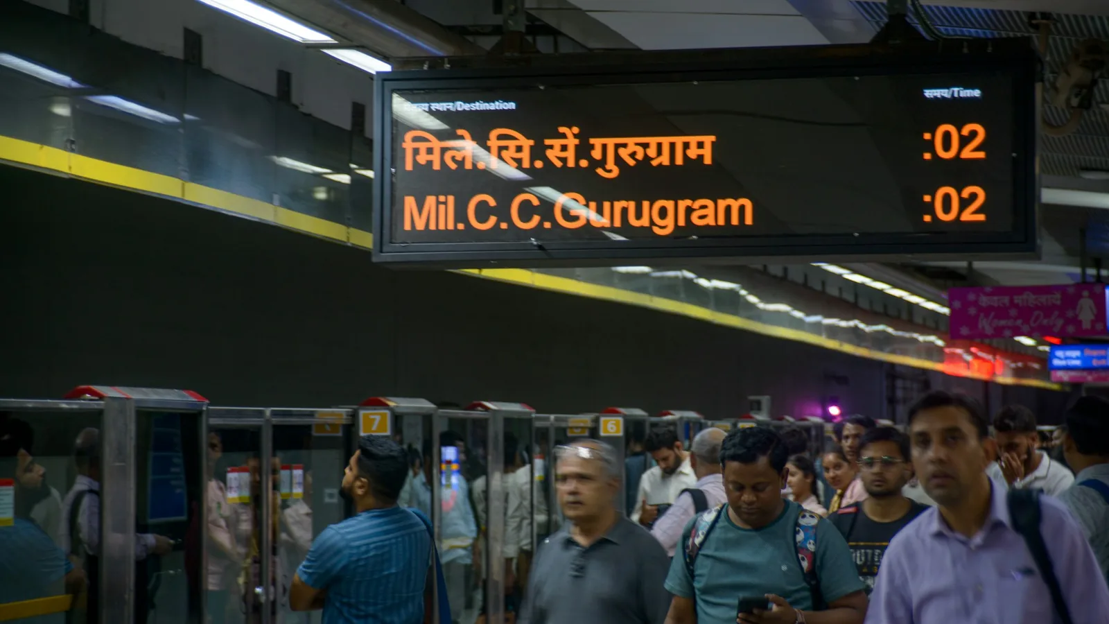
Real-time ridership analytics turns passenger counts into a live view of demand across a public transport network. Operators can see where people are boarding, where they are leaving, and how vehicle occupancy changes as services move along their routes.
The goal is not to collect more numbers. It is to make current service conditions visible early enough for operations teams to assess them.
Start with three ridership measures
Automatic Passenger Counting (APC) provides three related measures:
- Boardings show how many passengers enter at a stop.
- Alightings show how many passengers leave.
- Occupancy estimates how many passengers remain on board after those movements.
Each measure answers a different question. Boardings reveal where demand enters the network. Alightings show where journeys end or interchange. Occupancy shows how the accumulated demand affects a vehicle between stops.
Viewed in real time, these measures can be grouped by vehicle, trip, route, stop, or operating area. Vehicle location adds the geographic context needed to interpret them.
Identify conditions that need attention
A live dashboard can help an operations team spot high passenger density, unusual demand, or a sudden difference between similar services. Alerts can draw attention to defined overcrowding conditions or other operational thresholds.
The data can support questions such as:
- Which vehicles are carrying the highest loads now?
- At which stops are the largest groups boarding or leaving?
- Is crowding concentrated on one route section?
- Are consecutive services carrying substantially different loads?
- Does the current pattern resemble the normal pattern for this time and day?
These signals do not explain the cause on their own. A disruption, event, weather condition, service gap, or normal peak can produce similar numbers. Operators still need service context before choosing a response.
Combine the live and historical views
Real-time data is strongest when it can be compared with previous journeys. A current occupancy level becomes more meaningful when the team knows whether it is typical for that trip.
Historical ridership records allow operators to establish normal ranges and review recurring patterns. They can compare days, time periods, routes, and stops, then use the live view to identify departures from those patterns.
This combination supports both immediate monitoring and longer-term planning. The same underlying passenger counts can feed live dashboards, automated reports, journey replay, and demand analysis.
Design dashboards around decisions
A useful ridership dashboard should present the information an operations team can act on. More charts do not necessarily create a clearer operational picture.
Teams should define:
- which conditions require attention;
- which route, vehicle, and time context is needed;
- who receives an alert or reviews the dashboard; and
- what follow-up confirms whether the condition is real.
Device-health information belongs in the same workflow. A missing count may indicate a sensor or communication issue rather than a vehicle with no passengers.
Build a current view of the network
Real-time analytics helps operators move from isolated vehicle observations to a network-wide view of passenger movement. Boardings, alightings, occupancy, and vehicle location together show where demand is developing and where a closer operational review may be needed.
See how WEBREATHE combines live ridership KPIs, occupancy, and vehicle location . For the planning view, read about using passenger-flow data to optimise routes, timetables, and costs .